Learning from the St Paul’s Cathedral Rebrand
When one of the world’s most iconic buildings reimagines its identity, the design world pays attention. So should every heritage organisation.
Meet Pentagram: The Studio Behind the Work
This is no small responsibility. To rebrand one of the most iconic institutions in London. Before we get into what they did, let’s get to know who they are.
Pentagram is widely regarded as the world’s most acclaimed creative collective. Founded in London in 1972, the studio now operates across London, New York, Austin, and Berlin, with 23 partners who work both independently and collaboratively across disciplines. Its portfolio spans brand identity, environmental design, digital products, and editorial work, and its client list reads like a roll call of the world’s most significant institutions.
What makes Pentagram unusual in the design world is its structure. It is a partnership in the truest sense — each partner owns the firm equally, leads their own projects, and brings their own creative direction. There are no creative directors above the partners, no hierarchy of approval. The work rises or falls on the individual partner’s talent and judgement.
For the St Paul’s project, the lead partner was Domenic Lippa, a figure with a long track record in brand identity for cultural and civic institutions. His previous work for heritage and cultural clients (including The Book of Kells Experience and Jane Austen’s House) gave St Paul’s confidence that Pentagram understood the particular demands of designing for organisations where history is not a backdrop, but the very substance of the brand.
It was that track record that brought the two together. And as the project would demonstrate, the trust was well placed.
The Brief: Vision Before Aesthetics
St Paul’s Cathedral has stood at the heart of London for over three centuries. Designed by Sir Christopher Wren in the late 17th century, its dome has defined the city’s skyline, its walls have borne witness to state funerals and royal weddings, and its stones carry the memory of a nation that refused to break during the Blitz. It is, as it has long been known, ‘The People’s Cathedral.’
So when a building this significant decides to rethink how it presents itself to the world, it raises a question worth taking seriously: how do you modernise something that is already a monument?
The answer, it turns out, lies in listening very carefully to the building itself.
St Paul’s didn’t approach this project with a superficial desire for a fresh coat of paint. The brief ran deeper than that. The Cathedral commissioned Pentagram to create a new visual identity to help it ‘articulate its vision for the future: To inspire faith, welcome everyone and be a cathedral for London and the world.’
That sentence is crucial. It tells you that the rebrand was rooted in purpose, not trend. Before a single typeface was selected or a colour palette assembled, St Paul’s had defined what it was for — and that clarity of mission became the foundation on which every design decision was built.
Pentagram also brought in Bert Preece and Adam Kaveney of Simple Revolution to develop brand strategy and verbal identity alongside the visual work. The message placed at the heart of everything: St Paul’s is for everyone. The Cathedral was to be reframed not as a remote, grand institution, but as a place to step inside, pause, and learn.
The Process: History as Source Material
What followed was a design process that any heritage organisation would do well to study.
Rather than arriving with a pre-formed concept, Pentagram began by going deep. As they describe it, ‘The design process began with a deep dive into the Cathedral’s rich history, drawing inspiration from both above ground and beneath it.’
That phrase — above ground and beneath it — reveals the texture of the research. The team explored letter engravings and stone carvings across the building and down into the Crypt, recovering typographic details that had existed in the Cathedral for centuries. These weren’t decorative references plucked from a mood board. They were genuine archaeological encounters with the building’s visual DNA.
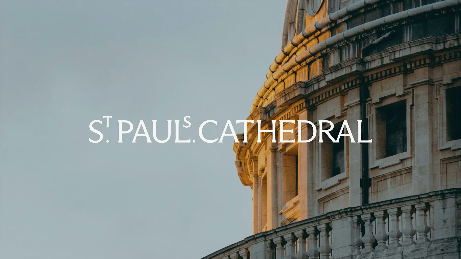
One discovery proved decisive. Typographic details found in a book in the Cathedral’s Library became the inspiration for the elevated ‘S’ and ‘T’ in the new wordmark. As Pentagram explains, ‘This unique detail reflects St Paul’s heritage while embodying its spirit of transformation and welcome.’ A small, subtle typographic choice, but one that carries centuries of meaning — and that connects the modern identity directly to the institution’s own archive.
Craft Meets Contemporary Design
The wordmark wasn’t just designed at a screen. It was tested in the physical world, worked through in collaboration with the Cathedral’s own stonemasons. Pentagram describe this directly: ‘Working closely with the Cathedral’s stonemasons, the wordmark was explored to see how it could be translated into a tangible form, respecting the authenticity while allowing a modern wordmark to be realised with precision and craft.’
This demonstrates that the design process wasn’t imposed onto the Cathedral, but grew from it. The stonemasons aren’t a footnote in the project; they’re co-authors. That kind of collaboration between contemporary designers and heritage craftspeople is rare, and the result is an identity that carries genuine material integrity.
The typeface selection followed the same principle. Dinamo’s Arizona Flare was chosen for its ability to hold both tradition and modernity simultaneously — its elegant, classic letterforms and subtle contemporary serif flares conveying heritage while remaining fresh and versatile. Bespoke ligatures were created to complement it, and Raleway was brought in as a secondary typeface for body copy and subheadings.
The colour palette, too, was drawn directly from the building. ‘The colour palette draws inspiration from the Cathedral’s interior,’ Pentagram note, ‘from the subtle tones of the floors and stone walls to the vibrant hues of the intricate ceiling mosaics.’ Nothing was arbitrary. Every choice can be traced back to something real and physical inside the building itself.
The Result: Authentic, Contemporary, Flexible, Dynamic
Pentagram Partner Domenic Lippa summarised the ambition clearly: ‘The ambition for us at Pentagram, the strategists and writers as well as the client themselves, was to create an identity that would be authentic, contemporary, flexible and dynamic; to be true for a unique building that exists so proudly in London, but also reflects many of the strengths of our country.’
He continued: ‘I genuinely believe the building has a special personality, and we needed to try to capture this. We hope we have created a fluid and flexible identity that will feel appropriate to the cathedral. But like the building itself, we hope it will surprise and delight the staff, volunteers, visitors and most importantly, worshippers.’
The result is an identity rooted in the building’s architecture, craft, and community, while being entirely capable of functioning across a modern digital and physical communications landscape. It doesn’t feel like a rebrand. It feels like the Cathedral finally finding the words — and the visual language — to say what it has always been.
What This Means for Museums and Heritage Organisations
The St Paul’s rebrand isn’t just a case study in good design. It’s a model for how heritage organisations can approach their own identity with the seriousness it deserves.
The lesson isn’t ‘hire an expensive London agency.’ It’s something more transferable than that. It’s about the attitude brought to the process.
Start with purpose. What is your organisation actually for, and for whom? A museum that can answer that question clearly is already halfway to a strong brand. Then look inward before you look outward: what does your own collection, your architecture, your archive, your community contain that could become the raw material for identity? The most powerful heritage brands aren’t invented. They’re excavated.
Respect what exists. The St Paul’s project is striking precisely because it doesn’t feel like a reinvention. It feels like a revelation — something that was always there, finally made visible. That approach demands patience and humility, and it produces results that no amount of trend-chasing can replicate.
And don’t underestimate craft. The collaboration with stonemasons isn’t a quaint detail. It’s a signal that the design has integrity — that it has been tested against the physical reality of the institution it represents.
Why Brand Matters More Than Ever
This brings us to a broader point that the heritage sector is only beginning to fully reckon with.
We are living through a period of extraordinary competition for attention. Audiences, particularly younger ones, encounter hundreds of visual identities every day, across social media, streaming platforms, retail, and digital media. Their visual literacy is high. Their tolerance for inauthenticity is low.
In this environment, a weak or incoherent brand is not a neutral position. It is actively damaging. It signals, however unfairly, that an organisation doesn’t quite know what it is, or that it hasn’t thought carefully enough about its audience. That’s a hard first impression to recover from.
Conversely, a strong, well-considered visual identity communicates something before a single word is read. It communicates that an organisation understands itself, respects its audience, and takes its public role seriously. For heritage organisations, which depend on public trust, public funding, and public goodwill, that matters enormously.
The digital dimension amplifies this further. A brand that was designed only for printed brochures and entrance signage will buckle under the demands of an Instagram grid, a short-form video, or a digital campaign. Modern brand design has to be flexible by default, capable of operating across formats, scales, and contexts in ways that would have been unimaginable a generation ago.
And then there is the emerging role of AI. As heritage organisations begin to explore AI-generated content, automated interpretation tools, and personalised digital experiences, a coherent brand becomes even more important. It’s the anchor — the thing that ensures that whatever technology produces still feels like you.
The Heritage Sector Deserves Better Design
The truth is that many heritage organisations are sitting on extraordinary visual and material culture — and presenting it through branding that doesn’t begin to reflect the quality of what’s inside. That gap is a missed opportunity: commercially, culturally, and communicatively.
The St Paul’s rebrand shows what’s possible when an institution commits to the process properly. It didn’t require abandoning its history. It required taking that history seriously enough to let it inform something new.
That’s exactly the kind of work that Heritage Social exists to support. We help museums, historic sites, archives, and heritage organisations build the kind of brand presence and digital identity that reflects the genuine quality and depth of what they do. Whether that means developing a visual strategy, building a stronger social media presence, or thinking through how emerging technologies like AI can be integrated responsibly, the goal is always the same: helping heritage organisations communicate as well as they preserve.
The future of the heritage industry isn’t just about protecting the past. It’s about making it legible, compelling, and alive for the people who need it most.
St Paul’s has shown what that looks like. The question is who’s next.